The work, seen.

Seven businesses that had the substance all along. Each one started invisible, the story buried under a safe default — until we brought the light.

Drag the light across each one — and scroll inside the frames to browse the full pages.

The relaunched curvepoint.ai — deep navy homepage with radiating signal rings and the headline 'Your space is full of information. Now you can sense it.'
CurvePoint's earlier website — a black and orange page headlined 'Privacy-First Entry Threat Detection for Schools'

CurvePoint

Brand system · Website · Product UX

CurvePoint sells privacy-first entry threat detection to schools — Wi-Fi sensing born from Carnegie Mellon research, with zero cameras required. Trust is the whole game in that market, and the brand, website, and sales collateral weren't carrying their weight in high-stakes conversations with school districts and investors. Everything needed to level up at once, and all of it had to earn trust at first glance.

Foundation first: a design-token system that lives in the website build and syncs into Figma. From there the pieces stacked — a dark, precise homepage in the spirit of Apple and Starlink, brand guidelines the team could run with, and product UX for alert flows that have to stay clear under pressure.

Signed to launched in six weeks

CurvePoint

Brand system · Website · Product UX

How it happened

Evan White — a few stories down this page — sent the introduction. I built the foundation first: a design-token system that lives in the website build and syncs into Figma, so design and code never drift. From there the pieces stacked — the homepage, the brand guidelines, product UX for the alert flows, and collateral for the schools pipeline. When the CTO came back with notes, I turned them into a sharper, glass-and-depth visual language.

What shipped

  • Design-token system — the website as source of truth, synced into Figma
  • Marketing site — designed and built in Framer
  • Full brand guidelines deck for the team
  • Alert-flow UX — wireframes for the product's notification system
  • Schools sales one-pager
  • Lead-capture forms with success, pending, and error states designed

CurvePoint launched in July 2026 with one coherent system — the same visual language across the site, the product, the deck, and the sales table.

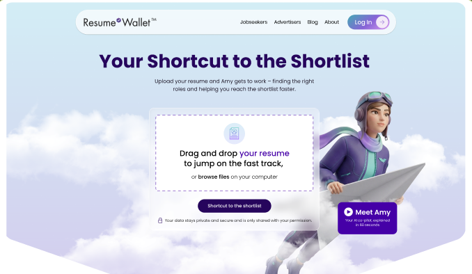
The rebuilt Resume Wallet site — 'Your Shortcut to the Shortlist' with Amy, the AI co-pilot
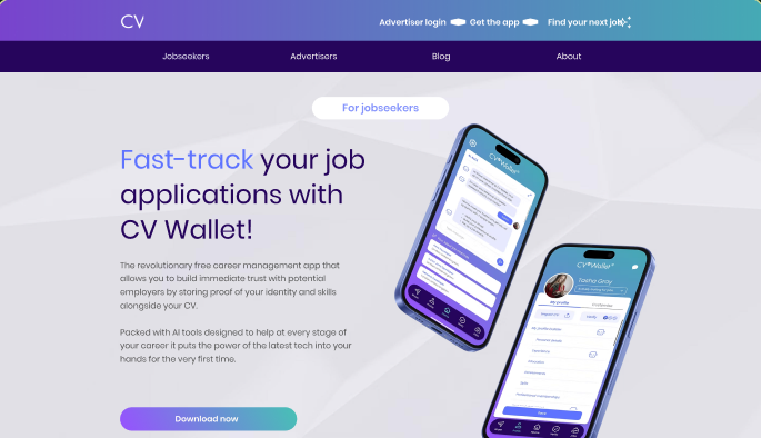
The earlier CV Wallet website — gradient app-download page

Resume Wallet

Rebrand · Website rebuild

Resume Wallet — formerly CV Wallet — was pivoting from a document-management app to an AI-powered job-matching platform, but the website still looked and sounded like the old product. The brand needed to catch up to the product vision, introduce Amy, the AI job-search assistant, and speak directly to jobseekers exhausted by the traditional job search.

I designed and built the new resumewallet.com around the jobseeker and introduced Amy, the AI assistant, as the site's protagonist. A team effort; my piece was keeping the jobseeker's experience at the heart of it.

Serving 5M+ jobseekers

"I've worked with Kate at multiple companies. She's a rare kind of marketer who can build the strategy and execute it."

— Serge Boudreau, Chief Revenue Officer, Resume Wallet

Resume Wallet

Rebrand · Website rebuild

How it happened

This was a team effort with smart contributions across engineering, product, and commercial. My role was keeping the jobseeker front and center — making sure every decision about messaging, structure, and design served the person who'd actually land on the page. I implemented the website build, helped steer the brand direction, and translated the team's product vision into a site that told a clear story: you're not alone, here's a better way, here's how it works.

What shipped

  • Website implementation — designed and built the new resumewallet.com from the ground up
  • Jobseeker-first narrative architecture — the page meets their doubts and hands them a clear next step
  • Amy's market introduction — positioning the AI assistant as the site's protagonist
  • Conversion-focused design — employer logos, product video, FAQ, and "5x more likely to reach the shortlist" proof points

The site launched as the public face of Resume Wallet's AI pivot — serving 5+ million jobseekers and supporting the company's partnership and investor conversations. A team accomplishment; my piece was making sure the jobseeker's experience stayed at the heart of it.

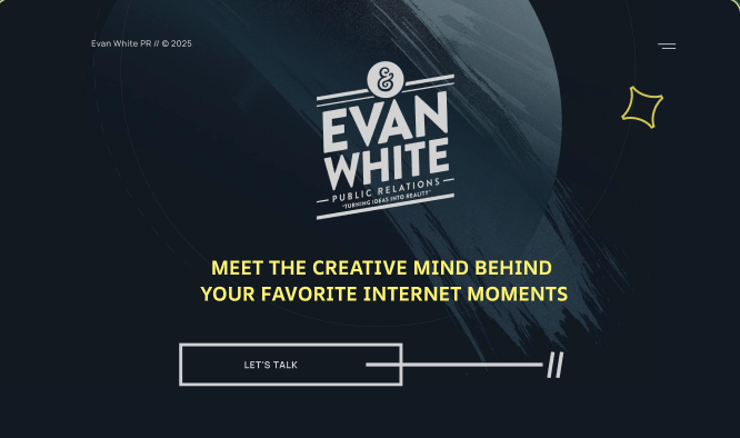
The new Evan White site — dark cinematic homepage, 'Meet the creative mind behind your favorite internet moments'
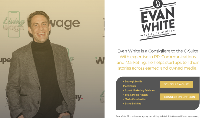
Evan White's previous one-page PR website

Evan White

Personal brand website

Evan White has been behind some of the most iconic moments in internet history — Google, Ustream, MakerBot, YouTube — but you'd never know it from his old website. It didn't serve him, didn't tell his story, and honestly, it hurt a little to look at. The gap between who he is and how he showed up online was enormous.

A cinematic scrapbook of a site: bold type, photo collages, easter eggs rewarding exploration, and the numbers that back the story. Every detail built to make someone go "wait — he did THAT too?"

90M+ reach · 1,566 events · 60+ brands

Evan White

Personal brand website

How it happened

Evan gave me near-full trust, and I ran with it. I immersed myself in his story — the brands, the milestones, the moments — and built the site as a powerhouse narrative: a cinematic scrapbook filled with easter eggs, photo collages, and bold typography that matched the energy of the career it represents. The structure flows like a story: who he is, where you've seen him (even if you didn't know it was him), the numbers that back it up, and what he offers now.

What shipped

  • Full website design and build — concept through launch
  • Personal brand identity — dark cinematic palette, bold type, the "//" motif throughout
  • Narrative architecture with easter eggs rewarding exploration
  • Stats and social proof — 90M+ reach, 1,566+ events, 60+ brands, making the invisible career visible
  • Services section positioning his PR, marketing communications, and events expertise

Evan finally has a digital home that matches the scale of his career. The site tells the story he couldn't — and does it in a way that makes people want to work with the person behind all those moments.

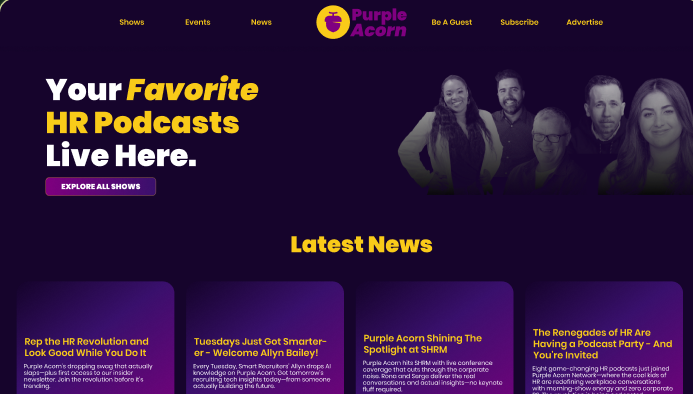
The rebranded Purple Acorn site — bold purple and yellow, 'Your Favorite HR Podcasts Live Here'
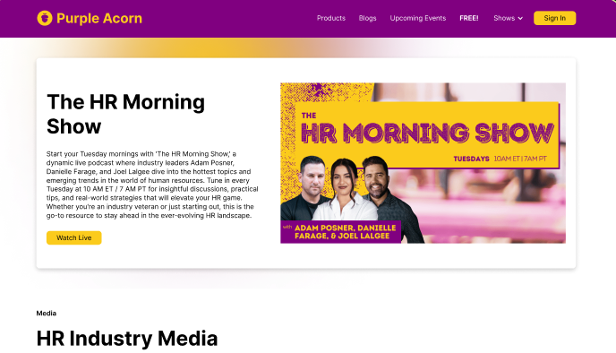
Purple Acorn's earlier website — a plain white media page

Purple Acorn Media

Brand identity · Website · Social presence

A growing HR-podcast network whose visual identity was lagging behind its sound. To attract sponsors and bring new podcasters into the network, the brand needed to command the room before anyone hit play.

A complete identity refresh — logo suite, audio/video logo, color system — plus a website built to convert sponsors and podcasters, and a social kit the team runs confidently without a designer in the room.

Roster and sponsorships expanded since

"It's all the little touches and thoughtful use of delight everywhere. Makes it extra magical."

— The Purple Acorn team, on the new brand

Purple Acorn Media

Brand identity · Website · Social presence

How it happened

I started with a discovery session to understand who Purple Acorn needed to attract — sponsors and podcasters look for different things before they trust you. From there I built the brand system outward, starting with the logo suite and audio/video logo, then the website, then the social assets. That order matters: each layer makes the next one credible, and the whole thing holds together without a designer in the room.

What shipped

  • Complete brand identity refresh — logo suite, video/audio logo, color system, typography
  • Full brand guidelines deck for team consistency across every touchpoint
  • Rebuilt website designed to convert sponsors and podcasters
  • Social media asset kit — templates, profile graphics, content frameworks ready to use
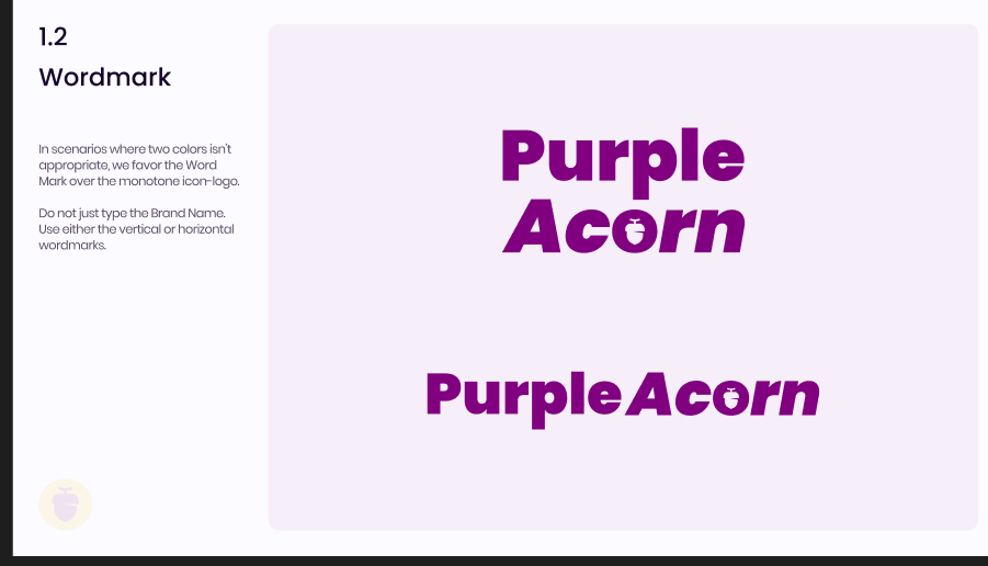
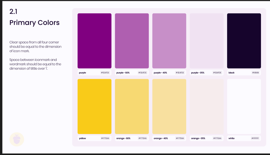
Purple Acorn wordmark variations in the brand purple Purple Acorn primary colours — purples, yellows, and tints with hex values

Purple Acorn's podcast roster and sponsorship partnerships have both grown since the rebrand.

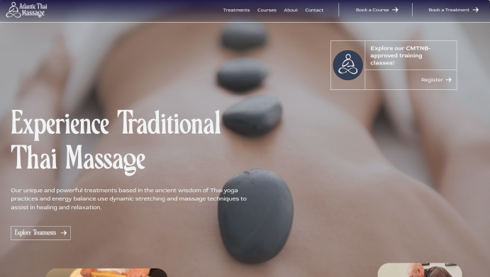
The redesigned Atlantic Thai Massage site — an elegant dark homepage with hot-stone imagery and course registration
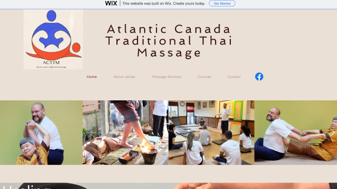
Atlantic Thai Massage's original self-built website on Wix

Atlantic Thai Massage

Brand identity · Website · Class registration

James Harper was launching a Thai massage practice and training school in Moncton — a first for Atlantic Canada. He'd built a website himself the year before, but it didn't look professional or say what he needed it to say. There was no brand, no logo, and by his own admission no clear sense of what needed doing first. He just knew the gap between what he'd built and what the business deserved was too wide to close alone.

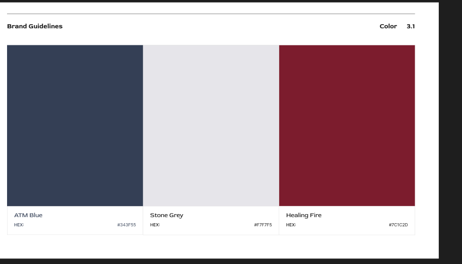
We excavated the real story — decades of study in Southeast Asia, monastery life, teaching in Nunavut — and built the brand from scratch around it: Midnight Blue, Red Rose, and a site with class registration students actually used.

A first for Atlantic Canada

"I didn't even know what I needed. Kate could read what was inside my heart and bring it to life. I now have a website and branding I'm truly proud of."

— James Harper, Owner, Atlantic Thai Massage

Atlantic Thai Massage

Brand identity · Website · Class registration

How it happened

I started by sitting down with James and walking through a discovery framework — helping him articulate what he was looking for before we touched a single design. He had a rich story (decades of study in Southeast Asia, monastery life, teaching in Nunavut and the Middle East) and a clear two-sided business: treatments and courses. I mined his old site for the photos and quotes worth keeping and wove them into the new one, built the brand from scratch — a logo and colour palette that captured the essence of his practice — set achievable deadlines for his content, and kept the whole process calm and clear for someone who gets overwhelmed by unfamiliar technology.

What shipped

  • Brand identity from scratch — logo suite, Midnight Blue and Red Rose colour system, typography, full guidelines deck
  • Full website design and build — a DIY site transformed into a dynamic, professional platform
  • Class registration — students browse and register for courses directly
  • Treatment menu architecture that educates clients before they book
  • Handoff resources — tutorial videos and a file bank for independent updates and social content
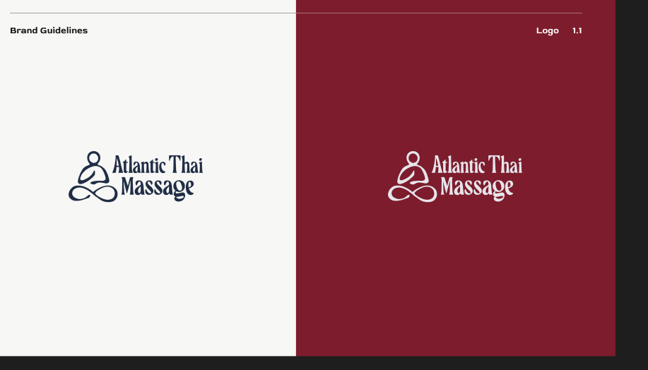
Atlantic Thai Massage logo suite — navy on cream and reversed on deep red Atlantic Thai Massage colour palette — ATM Blue, Stone Grey, Healing Fire

James got a brand and platform that matched the depth of his practice.
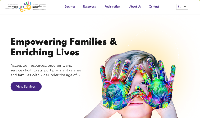
The redesigned centre website — 'Empowering Families & Enriching Lives' with vibrant painted-hands imagery and bilingual navigation
The centre's previous website — a muted template homepage

Early Childhood Family Resource Center

Website redesign · Brand refresh

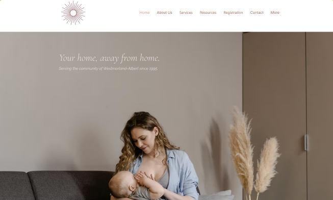
The centre had a website, but it didn't represent them. It wasn't clear what they offered or who it was for, and it lacked the warmth needed to help new families feel optimistic about reaching out. For an organization serving parents of young children, the digital front door needed to feel as welcoming as the people inside — and it needed to work in both official languages.

I restructured the site around their four service pillars — Prenatal, Postnatal, Early Years, Parenting — and brought the warmth forward with bright colour and real testimonials. Years later, I still help as needs evolve.

Bilingual · four service pillars

Early Childhood Family Resource Center

Website redesign · Brand refresh

How it happened

I started by understanding the audience — parents of young children who are often overwhelmed, short on time, and looking for reassurance that help exists. The brand needed colour and life. I restructured the site around the four service pillars so families could find what they need immediately, and brought the story forward through vibrant imagery, warm colour, testimonials, and clear service descriptions — the site finally reads as an invitation.

What shipped

  • Brand refresh — colour, imagery, and warmth to match the organization's spirit
  • Full website redesign restructured around services and audience needs
  • Bilingual support throughout
  • Typography and design system for consistency across pages
  • Testimonial and community sections to build trust with prospective families
  • An ongoing relationship — years later, I still help with updates as needs evolve

The board was over the moon. The site finally represents who they actually are — a warm, vital community resource — and makes it easy for parents to find services and feel welcome. We've stayed in touch ever since.

The Forbes MediClinic site — misty mountain hero with the clinic's script wordmark and patient and practitioner pathways

Forbes MediClinic

Brand identity · Website

Dr. Stewart Forbes brings evidence-based ketamine infusion therapy to patients across the Maritimes from the Moncton Health Collaborative Building — care that asks for a calm, credible introduction. His earlier site was a plain template page that gave anxious patients little reassurance and referring physicians little confidence.

A brand and website built for two readers at once: the patient weighing a decision they're nervous about, and the physician deciding where to send them. Script wordmark, mountain light, and a step-by-step treatment journey that answers questions before they're asked.

Serving patients across the Maritimes

Forbes MediClinic

Brand identity · Website

How it happened

Care this personal needs a website that lowers the reader's shoulders. I built the brand around stillness — mountain light behind a hand-drawn script wordmark — and structured the site as two clear pathways. Patients check their eligibility and see exactly what a course of treatment looks like, from assessment through aftercare; practitioners get a direct referral route. Dr. Forbes' own presence anchors the whole thing, so patients meet their doctor before they ever call.

What shipped

  • Brand identity — script wordmark, colour guide, and brand guidelines
  • Full website design and build
  • Dual pathways from the first screen — patients check eligibility, physicians refer
  • Treatment journey laid out step by step, from assessment and plan through aftercare
  • Meet Your Doctor — Dr. Forbes' credentials and approach, front and center

The clinic's digital front door now matches the care inside it — live at forbesmediclinic.com, built to work for patients and the physicians who refer them.

Your story could be next.

Every one of these started with a conversation about what wasn't landing. Tell me what you've built, and we'll figure out what the world should be seeing.

Let's talk