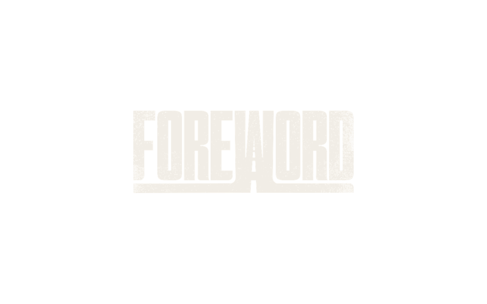
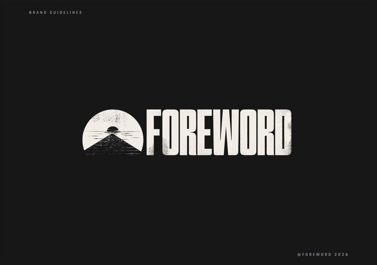
Concept One — the road through the letters.
A heavy wordmark with the road cut straight through it, so the name and the road read as one shape.
Case study · Brand identity · Website
Connor and Andrew Buss have been making films together for ten years. Their brand hadn't kept up with the work, so we rebuilt the identity and the website in time for their ten-year relaunch.
Real people, real stories, told together
For many years, we had to be quiet. This year, we get loud.
“When people say, oh, yeah, I saw your website — I die a little bit on the inside.”
Connor and Andrew started Foreword Films ten years ago with a van and a camera, and a knack for finding the story next to the story. Since then they've made films for Red Bull, Anheuser-Busch and NFL Network. The brand stayed where it started. After COVID they were in survival mode and said yes to everything, and the work they were proudest of stopped showing up in how they presented themselves.
The timing mattered, too. Andrew told me later: “The last few months, I've had more people ask for our website than I've had in the last three years.”
They wanted to tell their own story better. Andrew said it simply: “We just wanna be able to tell it better than we've done the last ten years.” Connor went further on our second call: “We've been serving the business for ten years. We need that business to start serving us again.”
Later they gave me the feeling they were after: a jolt, like a flat heartbeat that suddenly spikes.
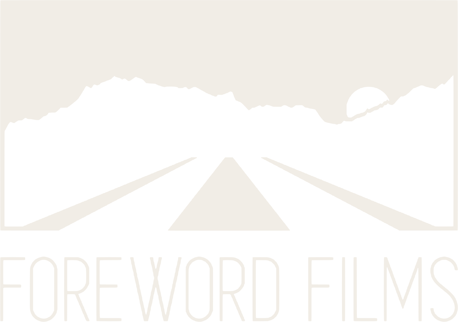
Their original logo was a road running into the mountains. Two brothers who built the company on road trips were saying “join me on this adventure.” The name has a deliberate misspelling, too. An uncle told them it would cost them clients. They kept it anyway.
Early on we agreed on what had to make it through the rebrand: the road, the feeling of motion, and the Super 8 nostalgia that runs through their footage. Everything else was up for grabs.
A heavy wordmark with the road cut straight through it, so the name and the road read as one shape.
Two arrows pushing the wordmark forward. They also make a fast-forward button, which felt right for people who cut reels for a living.
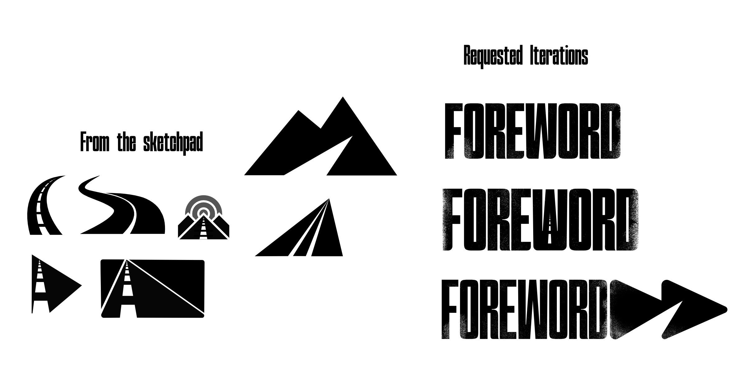
The review surprised me. Both brothers went straight for the heaviest weight of the wordmark, and neither of them was into the triangles. Connor kept pointing at a thin line in one of the road sketches, a delicate stroke against all that bold type. Andrew had a feeling he couldn't quite name yet, something like a national-park patch: simple, and obviously theirs.
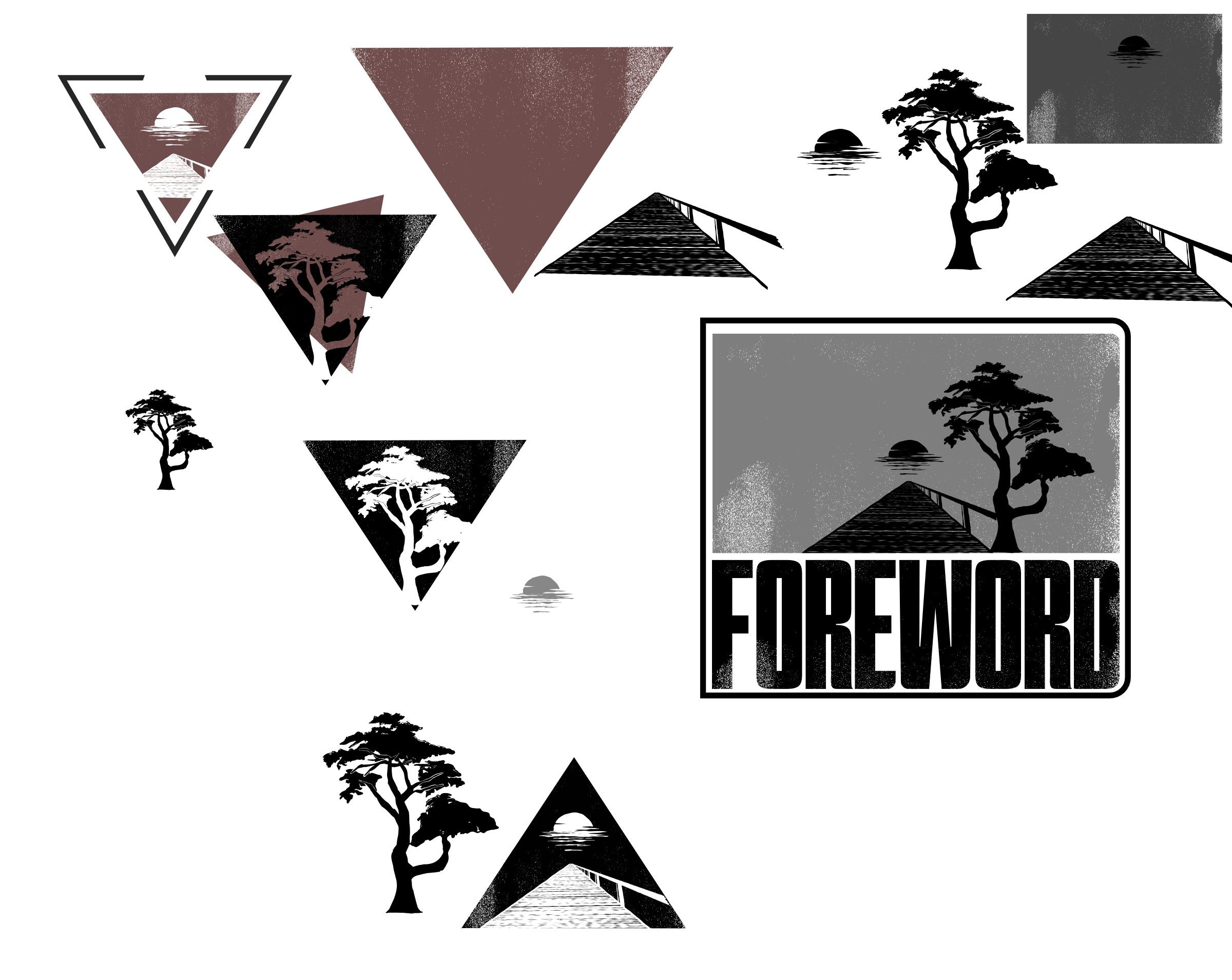
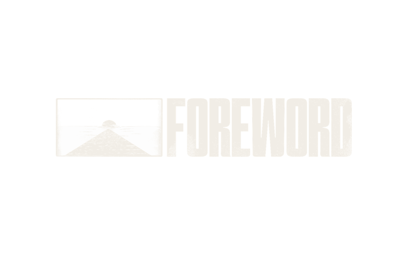
Andrew's national-park patch. Textured and framed, like it's been stitched onto a jacket for twenty years.
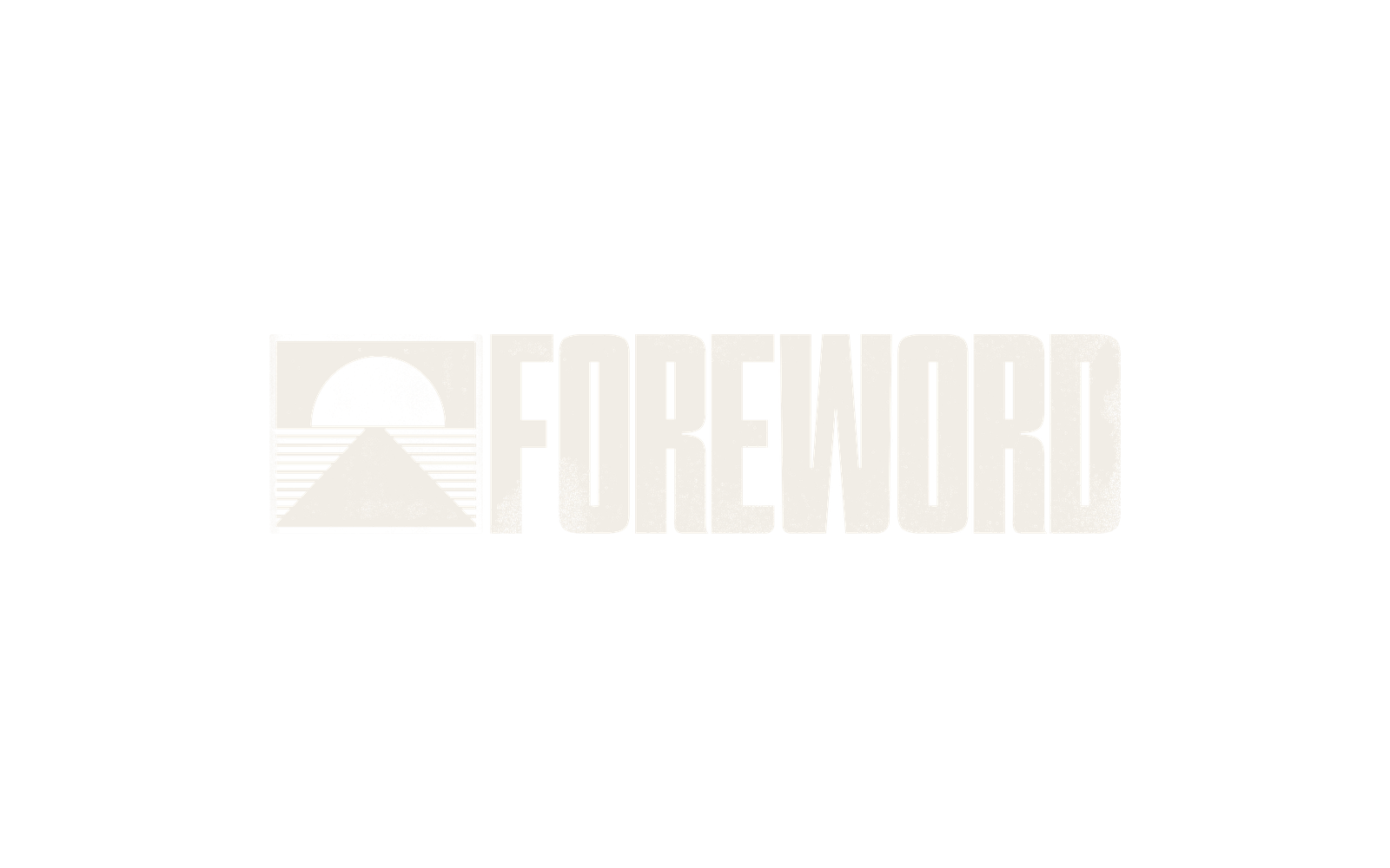
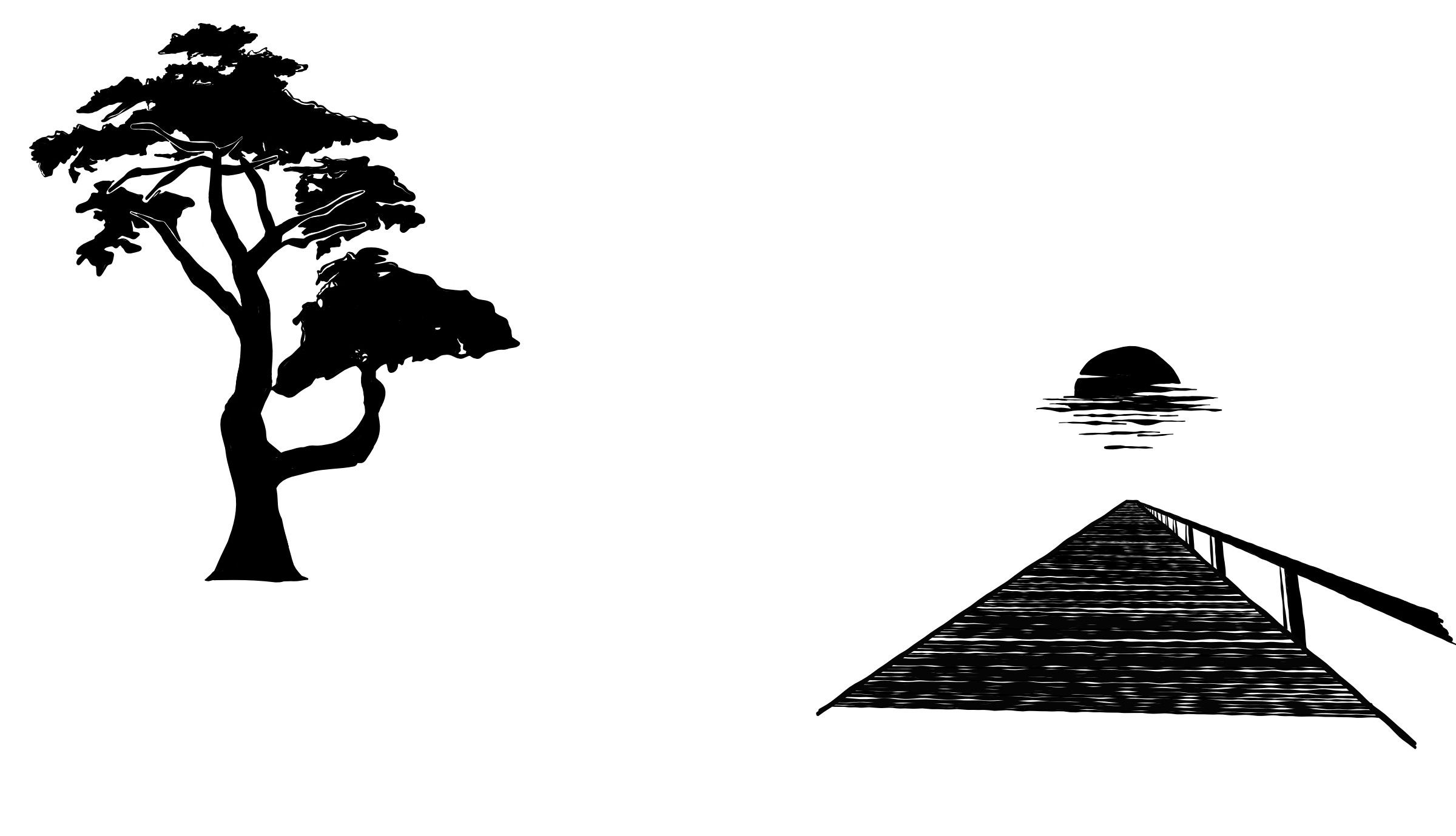
The horizon drawn in thin lines, the detail Connor had spotted, next to the heavy wordmark.
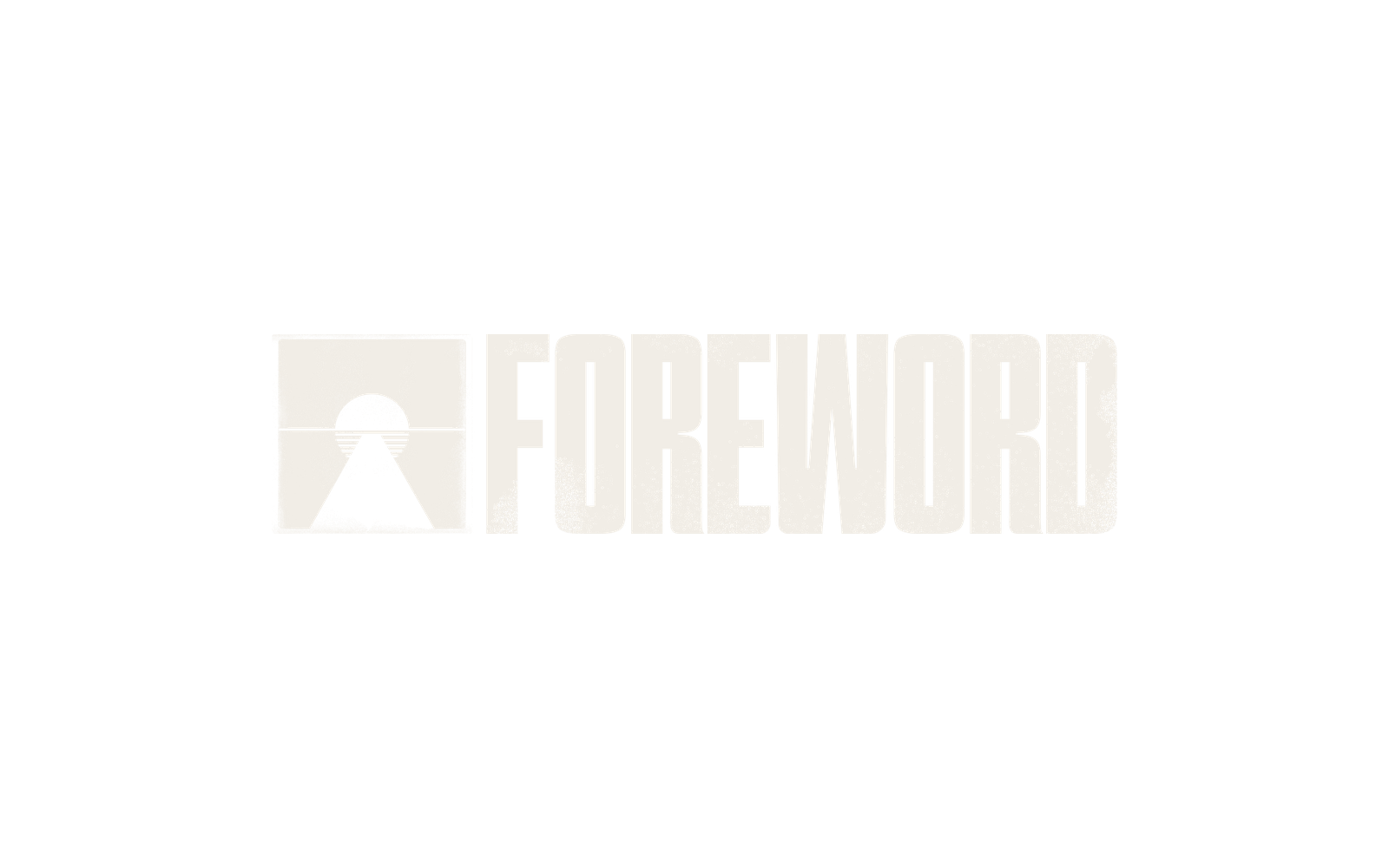
The road seen through a keyhole, like you're peeking at what's on the other side of the door.
My favourite was the keyhole. It had the most idea in it, and I loved that it turned the road into something you look into.
I also knew which one they'd pick. The badge carried the nostalgia they'd been describing since our first call — the van and the Super 8 footage, ten years on the road together. Their gut and the brief were pointing at the same mark, so I went with them over my own taste.
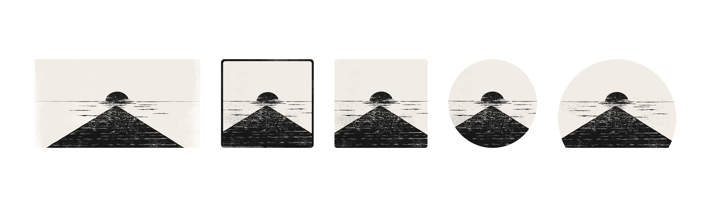
So we refined it. I tested the mark in five frames and ended up opening the badge's box into a semicircle, with the sun over the dock and the hand-printed texture kept. The heavy wordmark they'd loved since round two sits right beside it.
The palette comes from their footage: Foreword Black for the frame, a deep Teal from the light at dusk, a warm White, and Gold for the burn at the edge of the film. Hightone Vol 2 sets the headlines in the same condensed weight as the wordmark, and Sansita keeps the body copy warm and a little bookish.
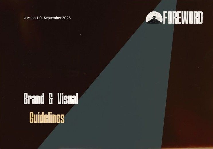
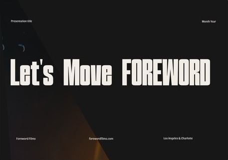
The guidelines run 41 pages and cover the logo, clear space, misuse, colour, type and photo treatments. There's also a 14-slide template deck, so the team can put together pitches for series and spec work without starting from a blank page.
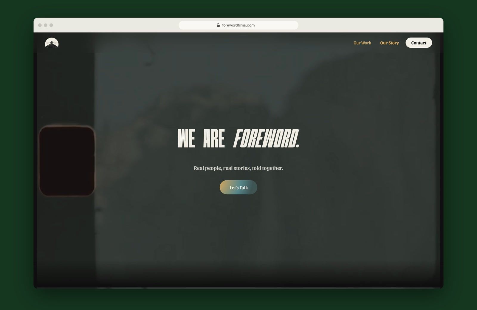
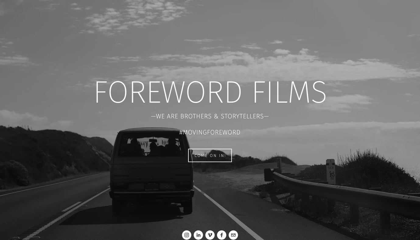
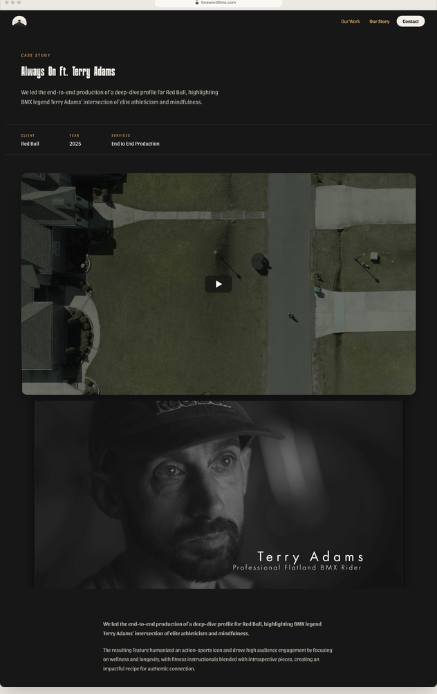
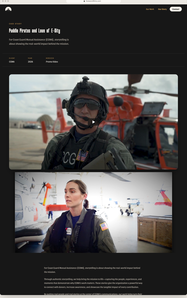
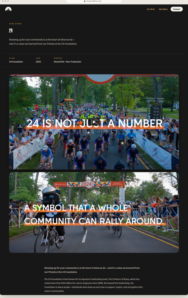
The site opens on a Super 8 loop and three words: We are Foreword. The rest is built around what they're best at, which is telling other people's stories. Every project page uses the same Framer CMS template: the film, the stills, the client and the story behind the job. The team can add a new project in a few minutes, and they own every part of it.
We kept the copy short on purpose, because people watch before they read. The testimonials are a bit of a joke: one is from Mom, and one is from “the future version of you.” As Andrew put it: “We want people to get a chuckle and remember it. And then they can be spending the time watching our actual stuff.”
“You can do really great work and have fun — that's what we're trying to do, and I think this website shows that so well. You really need to understand people. The two hours that we spent talking the first time, I didn't know why she needs to know all this stuff. And now I realize why. The most amazing thing that you've been able to do is learn ten years of [Connor's and my] life and then just put it here.”
“You've got to give me room to cook.” — Kate
“And you did.” — Andrew
“I'm glad. You've been such a pleasure to work with. And it's like sad. It's like, I almost want to start a new business and then be like, Kate, we got to work together again.”
Written review from Andrew and Connor: arriving October 2026
If your brand still looks like year one, tell me what's changed since. That's where we'd start.